Select_Pace_Rating/Jockey_Method
Select_Pace_Class_Jockey_Method

Display Form Chart
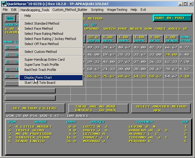
Figure 1 - Selecting "Display Form Chart"
Sometimes taking a little extra time to discover a horse's form can help you either bet heavier on a race, or back off a bit. After using QuickHorse to handicap a race, selecting this feature will allow you to plot a horse's past performance data over the past 10 races to see if that horse is improving or getting worse.
What data does the Form Chart display? It's up to you as you can select any piece of data available in the QuickHorse database related to performance. Even better, you can select a Custom Column that you've created or that comes with QuickHorse that involves using a horse's past performance data.
For example, the A1FRR column, "Brohamer 1Fr Rating Average".
Working with the Input Menu
Now that you know what this feature does, let's look at how a user gets it to work.
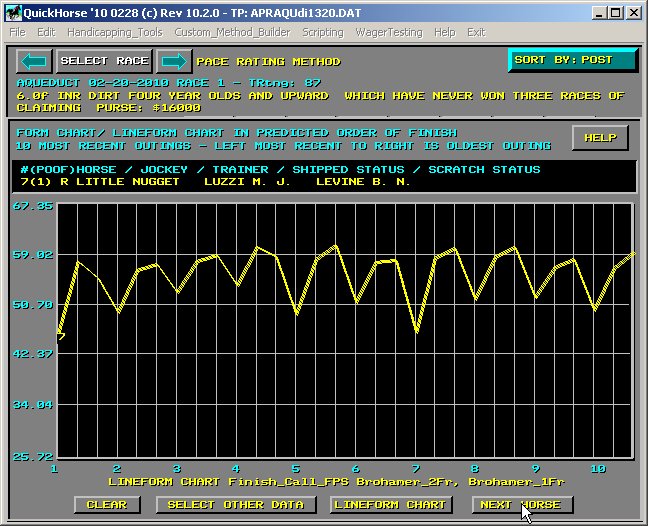
Figure 2 - The Form Chart Display
After selecting the feature, the display above is generated. It show the information on the QuickHorse's Top Pick in this race. The information is shown in the top black box. Below that is a graphics chart plotting the data shown at the bottom of the display over the past 10 races. The most recent race plot is on the LEFT HAND SIDE of the display and the 10th race back is shown at the RIGHT. Notice the data plotted is "Lineform Chart Finish_Call_Fps Brohamer_2Fr, Brohamer_1Fr".
This data is selected by clicking on the "LINEFORM CHART" button. You may use this selection or you may choose other data (single data items) from the QuickHorse outings (past performance lines) database.
For now, let's just look over the chart. As you can tell immediately, there is consistency within this horse's prior outings. A "dip" in performance occurred the 7th race back, but the horse rebounded the next race. A "dip" occurred in its last race. It could rebound today (it actually did win today's race).
You can use the "Next Horse" button to overlay the 2nd pick's more recent 10 outings data. Clicking that button again will get the 3rd pick, etc. After selecting many horses the display might get a little hard to read, so you can click "CLEAR" and all the data will disappear except for the most recently selected horse.
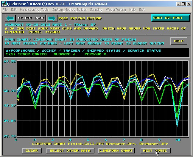
Figure 3 - Chart of all 5 Horses in this Race
In this particular race it easy to see that with all the horses (5) plotted you can see that QuickHorse's first pick is much the best, at least it's past outings data measures higher than any other horse. The method shows this as well, as horse 7 has the highest values in many of the columns - YELLOW color code shows that highest value when looking at the handicapping method.
Scratching a Horse
What happens if you look at the number 1 pick and its past outings indicate it is out of form? What we mean is, its data seems to be trending downward after showing better in prior races. Perhaps you simply want to scratch that horse immediately, and you can. Just move the mouse cursor to the smaller of the two black windows, the one containing the horse's name and click there with your LEFT MOUSE BUTTON.
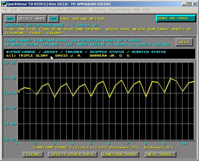
Figure 4 - Horse 7 was Scratched so Horse 6 (Second Pick) is Shown
To un-scratch Horse 7, all you do is use the NEXT HORSE button until Horse 7 shows up (last), then click on its name again. Notice when you find Horse 7, its info is in RED and it shows "Scratched" and no line is charted for it, so its easy to see what you've done. Once you un-scratch it, it returns as the leader.
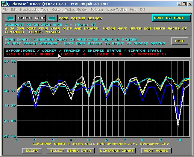
Figure 5 - A Scratched Horse Can be Un-Scratched
The "SELECT OTHER DATA" Feature
Assuming you want to select your own measures of form, you simply click on "SELECT OTHER DATA".
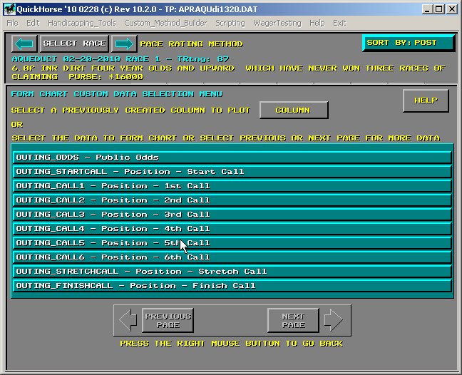
Figure 6 - Selecting a Column or Individual Data
You have two options, either to page through the outings data elements and choose one, or to select a pre-programmed Column. You can find out more about Columns and Methods by looking at the "Custom Method Builder" Menu Bar item. For now, let's select a data item from the list.
Use the Next Page button to access other data pages until you see "FPS Sartin Sustained Pace". Click on that data selection.
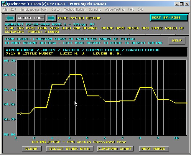
Figure 7 - Changing the Data to Form Chart
Note that below the chart the data selected description shows up. This data will now be set until you change it. The idea is for you to play around with this display until you find a data item, or Column which best shows form. The item you select is the same for every track and every race. In other words this information is GLOBALLY selected and doesn't change the way your TRACK PROFILE data changes so keep that in mind.
Now try selecting a Column on the "Select Other Data" Menu. We leave that up to you as a test of your ability to use the Left Mouse Button.
Notice that when picking single items of data, whether it be a Column or past performance data, that the CHART shows that data as a flat line with a length of 2 vertical bars in the display - see Figure 7 versus Figure 4 where 3 data items are plotted per outing.